Updating and Branding A PhillyCollector Blog
Okay, I am overdue a makeover. Well, A PhillyCollector is due a makeover. While I'm at it, why not throw in some branding, too? This is the year to go BIG. I'm working on a Pinterest board with ideas about colors and fonts and layouts for A PhillyCollector. If you'd like to throw in suggestions or tips, please do. In the meantime, here are some past faces of A PhillyCollector, courtesy of the Internet Archive.
 |
| 2011 |
 |
| 2012 |
 |
| 2012 |
 |
| 2014 |
 |
| 2015 |
I like the airy look, but it's too bare and too cluttered along the side. I've got two colors in mind. I haven't used them before. I'm saving them because I don't want to spoil any color suggestions you might have. Feel free to advise as you would - if I went to a party wearing heavy lime green eye shadow, orange rouge, and silver tinsel hair swatches, you'd tell me I was a shade garish, hmm?


ReplyDeleteI like 2014!
sigh. I know what you mean. I could not post pictures on either my Pumpkin Hill Studios blog or my One Sixth scale dollhouse blog from my computer, I had to do the hotmail thing which totally messed up my pictures and cut them in half, because blogger was in its perverted way, making me 'update'. Sometimes I really hate Google. I loved my layout on my blog I had everything exactly configured like I wanted it and then I had to change it to this stark minimalistic yuck.
ReplyDeleteI like your 2012 and some of your other previous headers. I have had to use the same 2015 format you are using now on my One Sixth Scale dollhouse blog and I'm not crazy about it, because I have had to do away with some of my graphics on the side. I am going to try and figure out how to put them back. It takes time to figure it out and they change it so much! I don't have time to figure out how to write code like facebook genius Mark Zuckerberg. Sorry for the rant but I know what you are going through, I feel your pain! Blogging should be a joy we share with others, lol. And it does look good, don't get me wrong. I'm more upset on my end as I liked my old layout better.
Hi D7ana, as you know I use a ready made template from blogger, so I'm not that good at giving advice, but I'd love to see some original graphic or pictures, in fact an original banner/header catches the eye and helps to identify the blog, as it is for magazines and newspapers!
ReplyDeleteAs far as colours goes, I like it as it is now, easy to read and airy.
Kisses Billa
Hi The Grandmommy and Lisa Neault!
ReplyDelete@The Grandmommy - thanks for sharing your opinion. I'm taking notes ;-)
@Lisa Neault - et tu? Sigh. Makes me wonder about Wordpress ... only I like my Blogger buddies.
Your current light green background has a cool vibe like cucumber sandwiches, but your previous background suited your antiques interest well.
Aside: when I started blogging in 2008, I had used that tan/brown background. It looks classy. But it didn't fit my vintage-to-modern subject.
P.S. "Rants" are welcome. Especially when our blogs or dolls are concerned ;-)
Hi Billa's Dolls and Fashions! Your suggestion to keep the blog "easy to read and airy" and to add an original graphic or picture helps a lot. I will not lose the good from this template, but I will make it more easily identifiable. Thanks for that advice ;-)
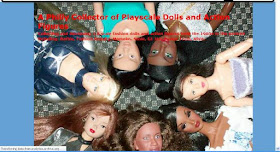
ReplyDeleteWait, have you not used that photo of doll heads as a header (heh) image since 2012? Because I could swear I saw it the last time I came here. Maybe my memory is worse than I thought...
ReplyDeleteI agree the current layout is airy and easy to read, but I'd definitely think you should have some kind of header image that catches the eye as well. If you're thinking about branding, maybe some kind of logotype to use across all platforms (sorry about the buzzwords but you know what I mean). Maybe just a doll photo + the blog name in some fancy font?
(That reminds me, I've been using the default background way too long.)
Ideally (bearing in mind these are suggestions I don't have the technical ability to do myself, on my own blog, so pie, meet sky), it'd be cool to see representative dolls in the header, but arranged so the title isn't covering them but is on a solid light background.
ReplyDeleteI don't care about color scheme so long as you have dark type on a light ground for the main posts. Neutrals probably set the dolls off best. I'd be tempted to look for neutrals and combos in this year's Pantone color trends (though then it has to be redone every year or so): http://www.elledecor.com/design-decorate/color/advice/g821/2015-pantone-color-of-year/?
The reason I want to see dolls in the header is that what drew me to your blog was the specific kinds of dolls and action figures you cover.
I don't have suggestions about colours, just keep it readable. You know, no handwritten fonts, bright colours, red text on black or stuff like that. I just went into blogger's template editor and picked colours for each element without the need to know coding and I tweaked several times until it looked good to me. The only change I'd like to see on your blog is more pictures. For example, when you list dolls grouped by a theme (like an ethnicity), there are no pictures or links. But I noticed you post more pictures now than when I started following you. Good luck with the rebranding! I'm sure you'll find a nice look.
ReplyDeleteI cant help. Every blog I've ever had I've always given it the same colors, lol.
ReplyDeleteI have always used a blogger layout, as simple as possible with now as few colors as possible. I like reading blogs that mimic a book: white background and black font. Too many colors are difficult on my eyes. I lose focus and interest.
ReplyDeleteIt seems your main color scheme, when color was used in the heading, has been blue. Of the ones, you have used, 2012 is my favorite image, but as one person commented, the blog title needs to be clearly visible.
Best wishes with whatever you choose.
dbg
Well, I'm no web designer and yet I know what how it is when you have a feeling of what you want but can't quite figure out how to get it to screen. I was always told, when you don't have the technical ability to do something smashing...keep it simple. My only advice would be for you to choose a different (but readible) font for your title.
ReplyDeleteI think everyone has some great points here- a good layout , simple, with as few colors as possible. Sadly as much as I dislike this new template it does show off the pictures brightly and clearly and cleanly and makes the text more bold. My old template though it had a classy old world style that I adored and what I was going for, an elegance, it probably did not show the pictures and the text to the fullest capability. So Black Doll Enthusiast and Smaller places have valid points that too many colors, too weird a fonts, can be distracting to reading a blog. I know one thing that can shut it down for me is MUSIC. I do not mind soft classical music that fits the mood, but some people have weird jazz music that totally doesn't need to be there. So these new blog templates do work and they do make our photos and text look more bright, readable and I like how they are larger than normal text, too. I hate black backgrounds with red, blue, white text. That really screws me up when I'm trying to read a blog, it's too artsy for me.
ReplyDeleteHi Anderson's All-Purpose, Smaller Places, BlackKitty, Muff, Black Doll Enthusiast, April_n_Paris, and Lisa Neault. Thanks for your helpful comments. I appreciate ALL of them.
ReplyDelete@Anderson's All-Purpose - I used the doll circle banner in 2013 for a while then went with the simpler text banner in 2014.
I like the idea of a doll logo and the title next to the photo. Thanks for that suggestion ;-)
@Smaller Places - Good idea - I wasn't crazy about the dolls faces being covered by text either. The dark text on light background is a must for me; I need the greater contrast - very nearsighted ;-P Oh and I will include some or an action figure, too.
@BlackKitty - Aside from the red text covering the dolls, I didn't like the limited contrast between that text and the blue background. That contributed to my wanting to change that header.
Thanks for the suggestion to include more photos. I'm inclined to do that. I LOVE to see others' photos so it stands that that's what people want when they visit my site. Especially with the ethnic or special issue posts ;-)
@Muff - your photos and videos are so inspiring ... I never notice your logo/header. Just see "Muff" followed by quality content, and I'm a happy, reading camper ;-)
@Black Doll Enthusiast - Thanks! I agree with you about dark text on white or light background - nearsighted, I am. Need all the help visually that I can get, ha ha. I admire your blog's header.
@April_n_Paris - I admire your backgrounds for your blogs, especially the stylist one ;-)
@Lisa Neault - I agree ... the new format does have some pluses ;-)
Hmmm. How much do you dislike the color schemes on my blog, I wonder? :) I love bright colors, though.
ReplyDeleteHi Barb the Evil Genius! Hmmm ... your blog is blue and white. My blog was blue and white. I still like that combination ;-) I'd gotten a new color combination in mind though. BTW, I like how your header changes for seasons and holidays.
ReplyDeleteI like the image of the dolls laying in the circle from 2012. Maybe you could do a smaller version of that picture and include it like an accent or part of your logo.
ReplyDeleteHi Chasing Joy! I definitely want a photo in or beside the blog title - thanks for that advice. Next time, I want to include 1 or more of the guys in the photo.
ReplyDeleteI like light and bright. It's happy and upbeat. At least to me it is. I love that you are branding too.
ReplyDeleteHi Jaye! Glad you find my blog "happy and upbeat." I try ;-)
ReplyDeleteAnd I'm going to try branding, too.
I see you blog, too I've got more online reading to do ;-)